

JIDA VI
JIDA Logotype
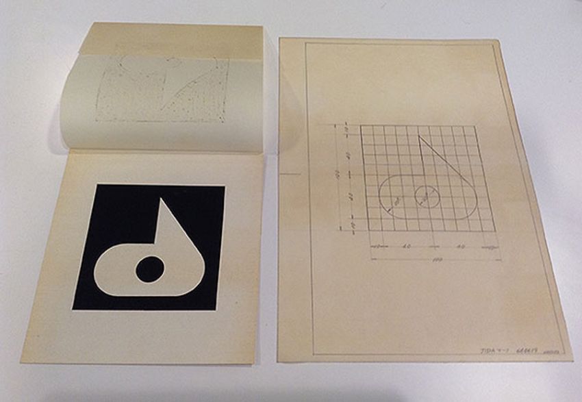
In 2020, the JIDA logo was redesigned by Taku Satoh.
The "d" mark, designed by Yusaku Kamekura in 1953, was given a modern shape, and the JIDA logo was redesigned to match.
The following is the basic concept of logo design.
1 The Power of Industrial
It should give a sense of strength and durability in an industrial product.
2 Neutral image as an association
Since the members are involved in all kinds of industrial products, the impression should be moderate and not one-sided.
3 Linkage with the mark
To have affinity with the mark, since it is often used alongside the mark.
4 UniversalityIt must be timeless and universal.
https://www.jida.or.jp/70th-top >>
Taku Sato
Graphic Designer
Graduated from Tokyo University of the Arts in 1979 and completed the graduate course in 1981.
After working for Dentsu Inc., established Taku Satoh Design Office (now TSDO Inc.) in 1984.
In June 2018, he was appointed President of the Japan Graphic Designers Association (JAGDA).
Started with the product development of "Nikka Whisky Pure Malt" and has been involved in package design for "Lotte Xylitol Gum" and "Meiji Oishii Milk". He has been involved in the graphic design of "PLEATS PLEASE ISSEY MIYAKE", the symbol marks of "21st Century Museum of Contemporary Art, Kanazawa" and "National Museum of Nature and Science", as well as branding of products and facilities, and corporate identity. He has also served as art director for NHK E-TV's "Nihongo de Asobo" (Let's Play in Japanese), general guidance for "Design Ah", and director of 21_21 DESIGN SIGHT, and has planned and held numerous exhibitions.
His publications include "plasticating thought" (Shinchosha).
JIDA’s Beginnings and Symbolic “d” Mark
JIDA’s Beginnings and Symbolic “d” Mark Masako Uchino, JIDA Professional Committee Member
The Japan Industrial Designers’ Association (JIDA) was founded in 1952. The association had no logo at the time, and the following year, the already renowned graphic designer Yusaku Kamekura followed through on a recommendation and joined JIDA. It’s said that Kamekura, noticing the absence of a mark, designed one. More interesting background on the “d” mark may be found in the commentary section of Yusaku Kamekura’s publication of selected works.
--------------------------------------------------------------------------------
No. 173: Japan Industrial Designers’ Association logo, 1953
The association may have been established about a year before I made its logo. I was made a member with some urging from two or three people like Masaru Katsumi. When I became a member, it was my responsibility to make the association logo. I illustrated the “d” from “designer.” The look of it makes me feel nostalgic; I quite like its simplicity and quiet, solid heft. A year later, I reconciled with the fact that I was principally a professional graphic designer and left the association. It became as if I’d joined the association just to design the mark. The funny thing is that, years later, architect Walter Gropius came to Japan and saw this mark, and he said how very Japanese it was for the mark to resemble some kind of agricultural tool. It’s a fairly well-known story now.
Yusaku Kamekura’s Designs. 1st ed. Tokyo: Rokuyosya, October 8, 1983: 224.
--------------------------------------------------------------------------------
Kamekura thus describes the conception of JIDA’s “d” mark and the early days of design. Incidentally, last year, several members notified our office that an Italian cosmetics company Davines sported a logo with a “d” strikingly similar to JIDA’s. A 2020 Tokyo Olympics emblem design proposal sparked a similar outcry, and in relation to this, the name Yusaku Kamekura, who designed the 1964 Olympic logo and poster, flashed across newspapers and the covers of magazines.
It’s against this backdrop that we thought to renew the curiosity of our members about JIDA’s historic “d” mark.
At its inception, the association took on a name translated into English as the Japan Industrial Designers’ Association. As the name expressly states, the association was for designers, not design itself, reflecting the philosophy of its founding members.
Years later, in 2021, in response to circumstances quite changed since JIDA’s founding, we elected to revise this name from the Japan Industrial Designers’ Association to the Japan Industrial Design Association.
We have nevertheless inherited the intentions set upon JIDA’s founding, and we hope our members continue to be interested in the present and future of industrial design.
Yukikazu Ueda, Director of the JIDA Professional Committee
Toshiharu Horikoshi, Professional Committee Chair
Research and text: Masako Uchino, Professional Committee Member (Patent Attorney)
(This text is a combination of new text and that which was written in 2015 by the Professional Committee during research conducted on the association logo.)
Postscript, 2021
Public Relations Committee
In Seichi no kozo: Nihon no indasutoriaru dezain (Structure of Dexterity: Industrial Design Works in Japan, ed. JIDA, 1983), Masaru Katsumi recalls pointing out that as a new design association, JIDA needed a logotype, and Isamu Kenmochi, who agreed with the notion, proposed they appeal to Yusaku Kamekura for its design. That Kamekura did go on to design the signature “d” mark is described above.
With the change to JIDA’s name in 2021, we deemed it necessary to change the association description and review JIDA’s logo (that is, the “d” mark). Reviews were repeated based on circumstances of the mark’s uses up to that point, and the research results compiled by various committees like the one seen above. Findings were reviewed thereafter by Taku Satoh, who is also the president of JAGDA.
With his deep understanding for and insight into JIDA’s “d” mark, which as described here has been passed down by numerous parties since JIDA’s founding, Mr. Satoh digitized Mr. Kamekura’s illustration guide for greater accuracy and designed a logotype fit to accompany JIDA’s mark.
We hope it, along with the changed association name, will be passed down into the future.
JIDA PV
In 2021, JIDA's motion identity was designed and created by Yugo Nakamura.
It was presented at the JIDA Center General Assembly in June 2021.
Below is the basic production concept
About JIDA Motion Identity
We aimed to express the universality of the field of "industrial design," which is ubiquitous in all areas from micro to macro and continues to change with the times. Our goal was to create a 30-second video that would allow the viewer to intuitively sense the universality of the field of industrial design.
(Nakamura talks)
https://www.youtube.com/watch?v=DyDCZCv0YIA
Yugo Nakamura
Web Designer
Interface Designer
Visual Image Director
Born in Nara, Japan in 1970. Graduated from the University of Tokyo, Graduate School of Engineering. Professor at Tama Art University.
Has been involved in the fields of web design and interface design since 1998.
In 2004, he established the design studio "tha ltd. Since then, he has been active in the fields of art direction/design/programming for numerous websites and videos in a cross-sectional and cross-sectional manner.
Major work includes a series of web direction for UNIQLO, UI design for the KDDI INFOBAR smartphone handset, and direction for the NHK educational program "Design Ah! Major awards include the Grand Prix at the Cannes Lions International Advertising Awards, the Tokyo Interactive Ad Award Grand Prix, the TDC Award Grand Prix, the Mainichi Design Award, and the Artistic Design Award. TDC Award Grand Prix, Mainichi Design Award, and the Minister of Education, Culture, Sports, Science and Technology's Art Encouragement Prize for New Designers.